An ecommerce dashboard can look impressive and still be almost useless. You open it and see revenue, orders, visitors, conversion rate, product charts, customer numbers, colorful graphs and fifteen percentage changes.
Everything is technically there, but after five minutes you still do not know what deserves attention. That is a dashboard design problem. A useful ecommerce analytics dashboard should not try to show every piece of information your store generates.
Its first job is to tell you how the business is performing, what changed, where the change came from and whether anything requires deeper investigation. The detailed reports should still exist. They simply should not compete for space on the main screen.
Microsoft's current Power BI dashboard guidance follows a similar principle: a dashboard should provide an overview, prioritize information the audience needs to monitor and allow deeper analysis through underlying reports rather than placing every detail on the dashboard itself. That distinction is the foundation of a useful ecommerce dashboard.
A Dashboard and a Report Should Not Do the Same Job
A report answers a specific analytical question. A dashboard monitors the current state of the business. For example, a customer retention report might contain detailed cohorts, acquisition periods, repeat purchase intervals and customer segments.
That information is useful when you are investigating retention. Your main dashboard does not need the entire cohort table. It may only need to tell you: Returning customer activity declined 8% compared with the previous period.
That is enough to create a signal. If the change matters, you open the deeper customer report. Shopify now uses this dashboard-to-report structure directly. Its Analytics overview contains customizable metric cards, and selecting a card opens the corresponding report for deeper analysis.
WooCommerce uses a similar approach in its Analytics overview, where performance indicators act as entry points into detailed reports. A well-designed dashboard should therefore answer: What should I investigate? The deeper report answers: What exactly happened?
The First Screen Should Give You the Commercial Picture
When a store owner opens the dashboard, the top section should communicate overall commercial performance within seconds. A practical first row usually needs a small number of outcome metrics such as revenue, orders and average order value.
Depending on the business, purchase conversion or completed sales may also deserve a place there. But the number alone is not enough. If your dashboard says: Revenue: $84,250 you still do not know whether that is good, bad or normal.
A better card shows: Revenue: $84,250 Up 9.4% vs previous comparable period A stronger card also provides a small trend visualization so you can see whether the increase developed gradually or came from one unusual spike.
Shopify's current Analytics dashboard supports date comparisons and percentage changes, while WooCommerce's analytics reports support comparisons with a previous period or previous year. Context should be built into the dashboard rather than requiring the user to calculate it mentally.
Every Important Metric Needs Four Pieces of Context
A useful dashboard card should tell you more than the current value. For an important metric, you should ideally be able to understand:
- Current value: What is happening now?
- Comparison: How is it different from the previous relevant period?
- Trend: Is the movement sustained, gradual or caused by an isolated event?
- Drill-down: Where do I go if I need to understand why?
This sounds simple, but many dashboards fail at the second and fourth parts. A merchant sees that orders are down 11%, but the dashboard provides no fast way to see whether the decline came from traffic, conversion, one channel or one major product.
The number becomes a warning without an investigation path. Good ecommerce dashboard design should reduce the distance between seeing a problem and reaching the data that explains it.
The Dashboard Should Show a Trend, Not Just Today's Number
A single number is a snapshot. Store owners need direction. Imagine two stores both generated $100,000 this month. Store A has grown steadily from $70,000 to $80,000 to $90,000 to $100,000 over four months. Store B normally generates $130,000 but recently fell to $100,000.
The current revenue is identical. The business story is completely different. Your dashboard should therefore include trend visualizations for the most important outcomes, particularly revenue and orders. The chart does not need twelve controls and seven colored lines. It needs enough historical context to help you see direction.
Shopify's current reporting tools allow merchants to select date ranges, compare periods and adjust visualizations, while Adobe Commerce Intelligence describes its dashboards as high-level views that organize reports around business performance and sales activity. The purpose of the trend is not decoration.
It is to answer: Is this a one-time movement or part of a pattern?
Show Sales Drivers Close to the Sales Result
Revenue should not sit alone at the top of the dashboard while the metrics explaining it are hidden several screens away. Keep its most important drivers nearby.
If revenue changes, you usually want to know whether the movement came from: Orders, average order value, customer activity, product mix or another major commercial driver. For example:
- Revenue down 12%
- Orders down 1%
- AOV down 11%
This immediately tells a different story from:
- Revenue down 12%
- Orders down 13%
- AOV unchanged
The first situation suggests customers are still purchasing at a similar rate but spending less per transaction. The second suggests fewer purchases are being completed.
Your dashboard has already reduced the investigation before you open another report. For a broader explanation of how connected metrics create better decisions, see the Ecommerce Data Analytics guide.
Website Stores Need a Buying-Journey View
Revenue tells you how many purchases succeeded. A good dashboard should also provide enough information to see where potential purchases are being lost. For website-based stores, a compact funnel can show movement through stages such as:
- Store or product visits
- Product views
- Add to cart
- Checkout started
- Purchase completed
Google Analytics' current Purchase journey report follows the same sequence from session start through product view, add to cart, checkout and purchase, specifically to show where users leave the purchase funnel.
You do not need a giant funnel visualization permanently covering half the dashboard. What you need is visibility into whether the relationship between these stages changed.
For example, if traffic remains stable but checkout completion falls sharply, that deserves attention. If traffic falls but conversion remains stable, acquisition may deserve investigation first. The dashboard should help you locate the stage where performance changed.
Marketplace Dashboards Need a Different Version of the Funnel
Amazon, Etsy and eBay sellers do not always have the same storefront funnel as an independent ecommerce website. That does not mean funnel thinking disappears.
The equivalent dashboard may use marketplace signals such as listing impressions, listing or product-page visits, orders and completed sales. The purpose remains the same:
How many potential buyers saw the product, how many showed stronger interest and how many eventually purchased?
This is why one universal dashboard template should not be forced onto every ecommerce business. The business questions can remain consistent while the underlying platform metrics change.
Customer Health Deserves Its Own Section
A store can produce healthy revenue this month while its customer base quietly becomes weaker. That is why the dashboard should contain a compact customer-health area rather than only sales information.
For many businesses, that means visibility into new and returning customers, repeat activity and potentially customer segments that deserve attention.
- A consumables brand may care heavily about repeat purchase behavior.
- A high-ticket furniture business may have much longer purchase cycles.
- A marketplace seller may have more limited customer-level information depending on the platform.
The customer section should reflect the business model rather than display retention metrics simply because they are available. For businesses where repeat purchasing matters, a useful dashboard signal might show:
Returning customer revenue: down 7% or: At-risk high-value customers: 84
Those signals are more actionable than a giant table containing every customer. Our Ecommerce Analytics decision guide explains why analytics becomes more useful when a signal leads to a specific investigation rather than remaining an isolated metric.
Separate Customer Acquisition From Customer Quality
A dashboard can easily make customer growth look healthier than it really is. Suppose new customers increase 20%. That is useful.
But if returning-customer activity drops significantly at the same time, your business may be generating more first purchases while weakening repeat business.
The customer section should make this difference visible. Do not collapse all buyers into one large number labeled "Customers." At minimum, stores where repeat purchasing matters should be able to distinguish customer acquisition from customer continuation.
Adobe Commerce Intelligence currently includes dashboards and reports around repeat purchases, lifetime revenue, customer segmentation and cohort analysis, reflecting how customer performance requires more than a simple total-customer count.
Products Need a Movers View, Not Just a Bestseller List
Most ecommerce dashboards contain some version of "Top Products." That is useful, but incomplete. Knowing which products generated the most revenue tells you what performed well. It does not tell you what changed. A better product section highlights both strong contributors and meaningful movers. For example:
Largest revenue increase: Product A, +$8,400Largest revenue decline: Product B, -$6,100
Now you know where to investigate. Product A may have benefited from a campaign. Product B may have lost demand, gone out of stock or had an important variant become unavailable. This type of view is often more useful for management than repeatedly displaying the same bestselling products every week.
Inventory Should Be Connected With Product Importance
Inventory is one of the clearest examples of why dashboards need context. A generic warning such as: 23 products low in stock sounds urgent. But what if 20 of those products barely sell?
Meanwhile, one high-revenue bestseller has enough stock for only two more days. The total number of low-stock products is not the real issue.
A useful inventory section should prioritize risk according to factors such as recent demand, revenue contribution, available quantity and expected replenishment time.
Instead of only showing: Low-stock products: 23 a more actionable dashboard could show: 3 high-revenue products at stockout risk That changes what the merchant does next.
Show Revenue Leakage Separately From Revenue Generation
Most dashboards are designed around money coming in. A useful ecommerce analytics dashboard should also show where value is being lost. Depending on the business, this can include abandoned checkout activity, refunds, returns, cancellations or failed payments.
These metrics should not overwhelm the first screen, but meaningful changes deserve visibility. For example: Checkout recovery down 9% or: Refund value increased 18%, mostly from Product X The second version is far more useful because it combines the warning with the area responsible for it.
Google Analytics' Checkout journey report is designed specifically to show progression after checkout begins, making it possible to identify where users fail to complete later checkout stages.The dashboard should surface the exception. The deeper checkout or refund report should provide the detail.
Alerts Should Be Prioritized by Business Impact
An analytics dashboard becomes much more useful when it tells you what requires attention. But this creates another problem. If everything is an alert, nothing is an alert. Imagine opening your dashboard and seeing:
14 SEO warnings8 low-stock warnings3 customer warnings6 product changes4 checkout notifications2 refund alerts
That is not prioritization. A better alert layer considers urgency and commercial impact. A high-revenue product likely to stock out tomorrow should appear above a low-impact metadata issue.
A 40% decline in checkout completion should receive more attention than a 2% movement in a stable metric. Useful alerts should answer three questions:
- What changed?
- How significant is it?
- Where should I investigate?
If the dashboard can answer those three questions, the merchant does not have to manually decide which of twenty red icons matters most.
A Dashboard Should Explain Unusual Changes
Traditional dashboards are good at showing that something changed. Modern analytics systems can go further by helping explain the relationship between changes. Suppose revenue falls 10%. A dashboard can show:
Revenue down 10%. A more useful analytics layer may show: Revenue declined 10%. Orders remained stable, while AOV fell after two high-revenue products became unavailable. That does not mean the software has proven the entire causal story.
It means the merchant has a much more focused starting point. AI can be particularly useful here when it analyzes connected store data and provides plain-language explanations grounded in the underlying metrics. The result should always remain verifiable through the actual reports.
Do Not Hide the Time Period
One surprisingly common dashboard problem is displaying numbers prominently while making the reporting period unclear. Revenue: $42,000
- Over what period?
- Today?
- The previous seven days?
- Month to date?
- Last 30 days?
A useful dashboard should make the selected date range impossible to miss. It should also allow relevant comparisons such as previous period, previous year or a custom comparable range.
Shopify currently supports preset, rolling and custom date ranges as well as previous-period and previous-year comparisons. WooCommerce Analytics also allows preset or custom periods and comparison with the previous period or year.
Time context is not a filter you should have to hunt for. It is part of the meaning of every number on the screen.
Show Whether the Current Period Is Complete
There is another timing problem. At 10 a.m. on Wednesday, this week's sales are incomplete. Comparing them directly with an entire previous week creates a frightening red percentage that means almost nothing. A well-designed analytics dashboard should clearly distinguish completed periods from periods still in progress.
Shopify's current Analytics dashboard explicitly identifies in-progress periods when rolling date ranges include the current time period. That type of context prevents merchants from treating incomplete data as a genuine decline.
Data Freshness Should Be Visible
Not every data source updates at the same speed. Orders may update almost immediately. Customer cohorts may refresh more slowly. Advertising data can arrive on another schedule. Marketplace information may have its own reporting delay. If your ecommerce dashboard combines multiple sources, it should show when relevant data was last updated.
Otherwise, a merchant can compare a current revenue number with a customer or advertising metric that is several hours behind and assume the mismatch represents a business problem. A simple label such as: Updated 6 minutes ago can be more valuable than another chart. Trust in a dashboard depends partly on knowing how current the information is.
Metric Definitions Must Be Easy to Find
Two platforms can use the same metric name and calculate it differently. WooCommerce, for example, documents separate definitions for gross sales, net sales, total sales, returns, orders and average order value.
Its current Analytics documentation defines AOV using net sales divided by orders. Your dashboard should therefore make important metric definitions accessible.
If a user sees "Revenue," they should be able to understand whether that means gross sales, net sales, total collected amount or another calculation.
The same applies to retention, checkout recovery, conversion and customer segments. A dashboard is not trustworthy simply because the numbers look precise. The user needs to understand what those numbers mean.
Multi-Platform Stores Need Consistent Definitions
This becomes even more important when a business sells across several ecommerce systems or marketplaces. A merchant may operate a Shopify store alongside Amazon and eBay.
Another business may use WooCommerce with an ERP and marketplace feeds. When those data sources come together, the dashboard needs consistent rules around:
- Order status
- Currency conversion
- Refund treatment
- Customer identity
- Time zone
- Sales date
- Product mapping
- Marketplace fees
Without normalization, combining numbers can produce a clean-looking dashboard built on inconsistent definitions. The visual layer is the last step. The underlying data model must make the numbers comparable first.
One Dashboard Does Not Mean One View for Everyone
The owner, marketing manager, inventory manager and finance team do not necessarily need the same first screen. An owner may want commercial performance, major risks and customer health.
A marketing manager may care more about acquisition, conversion and customer quality. An operations manager may need inventory, fulfillment and product availability. A finance user may need revenue adjustments, refunds, returns and margin information.
Adobe Commerce Intelligence supports dashboard sharing and different access permissions, while Microsoft recommends designing dashboards around the audience and the decisions they need to make.
The goal is not to duplicate the entire analytics system four times. It is to make the most relevant information easier for each role to reach.
Should Profit Be on the Ecommerce Dashboard?
Yes, if the data behind it is reliable enough. A revenue dashboard without cost context can make growth look healthier than it really is. However, displaying an inaccurate profit estimate can be worse than displaying no profit at all.
Before placing profit prominently on the dashboard, make sure the calculation includes the costs the business actually intends to measure, which might include product cost, discounts, marketplace fees, payment fees, fulfillment, shipping subsidies, advertising or other expenses.
The exact definition depends on whether you are displaying gross profit, contribution margin or another profitability measure. If cost data is incomplete, label the figure clearly rather than presenting it as definitive profit.
Should Traffic Be on the Main Dashboard?
For most direct ecommerce websites, yes, but only when it provides context for purchasing performance. Traffic by itself is not a commercial outcome. A store can double sessions and generate no additional sales.
Traffic becomes useful when viewed beside conversion and orders. If sessions drop and orders drop proportionally, acquisition may explain much of the result. If sessions remain stable while orders fall, the problem is probably further down the purchase journey.
For marketplaces, replace website traffic with the platform's appropriate visibility and listing-engagement signals. The dashboard should follow the business model, not blindly follow a standard template.
How Many Metrics Should the Main Dashboard Show?
There is no universal number. But if the first screen contains thirty equally prominent KPI cards, it is probably doing too much.
Microsoft's dashboard guidance recommends keeping the overview uncluttered, emphasizing the most important information and using deeper reports for detail.
A practical ecommerce dashboard might have around eight to twelve primary signals on the main view, depending on business complexity. That is not a strict rule.
The better test is simpler: Can the owner understand store health and identify the most important exception without scrolling through several screens? If not, the overview probably needs editing.
What Should Not Be on the Main Dashboard?
A dashboard can become more useful by removing information. You probably do not need every product row, every customer segment, every campaign, every inventory quantity or every geographic breakdown visible at once.
Those belong in detailed reports. Be especially cautious with metrics that look interesting but rarely change a decision.
A large number of page views, social followers or raw customer records may feel impressive, but if they do not help explain commercial performance, they may not deserve premium dashboard space. The main screen should be protected from reporting clutter.
Give Every Warning an Investigation Path
A dashboard should never leave the merchant at: Conversion is down 14%. The next action should be obvious. Open purchase funnel. Likewise:
- Returning customer revenue is down. Open customer analysis.
- High-revenue product at stockout risk. Open product and inventory details.
- Refund value increased. Open refunds by product.
This interaction design matters because a useful dashboard does not merely summarize the business. It acts as the entry point into analysis.
A Practical Ecommerce Dashboard Blueprint
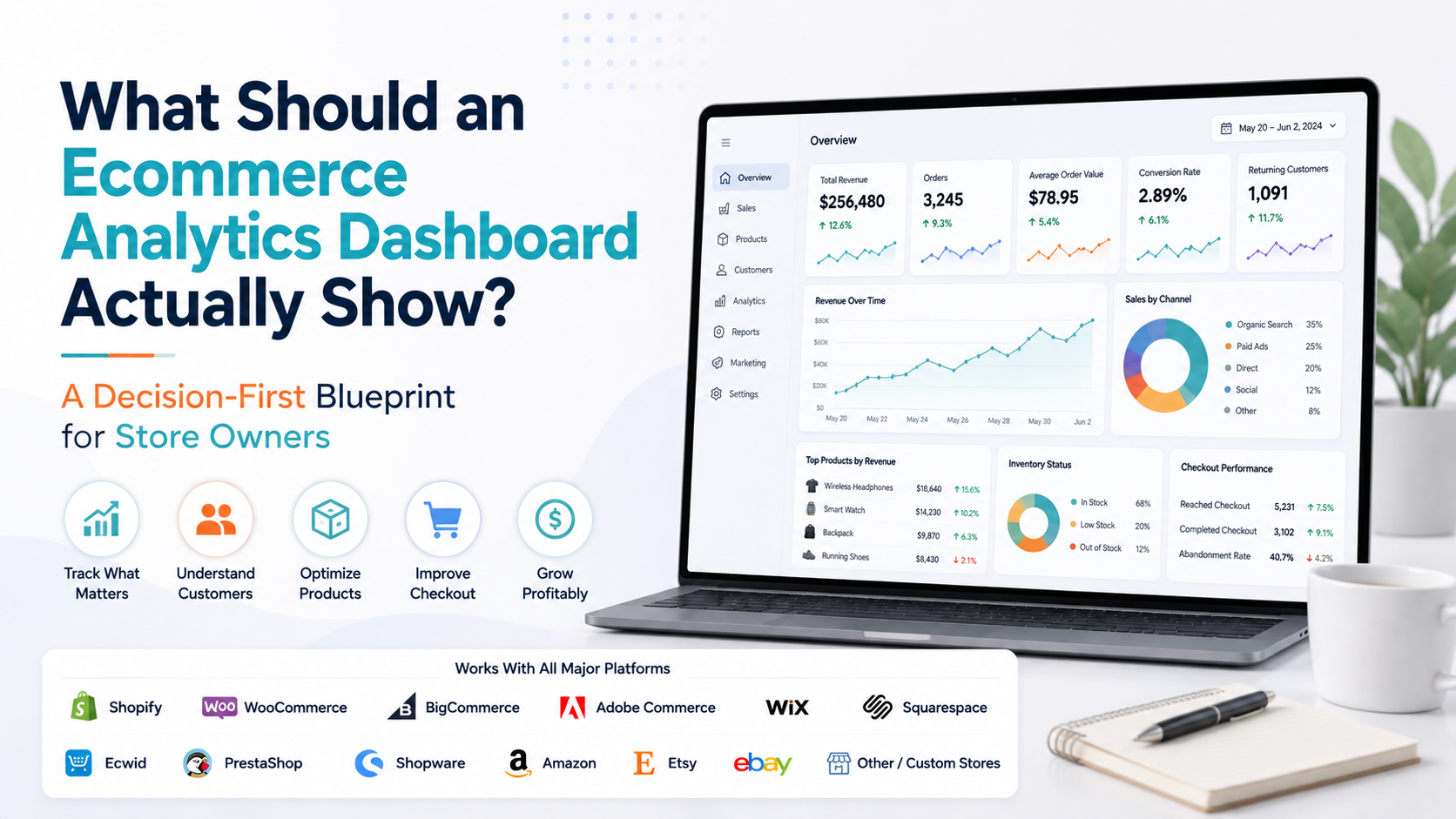
If you were building the dashboard from scratch, a strong structure could look like this:
- Commercial overview: Revenue, orders, AOV and purchase conversion with period comparisons.
- Performance trend: Revenue and order movement across the selected period.
- Demand and funnel: Traffic or marketplace visibility, product engagement, cart, checkout and purchase completion.
- Customer health: New versus returning customers, repeat activity and meaningful customer-risk signals.
- Products: Biggest positive and negative product movers, not only permanent bestsellers.
- Inventory: High-impact low-stock and out-of-stock risks connected with product performance.
- Revenue leakage: Checkout abandonment, recovery, refunds, returns or cancellations where relevant.
- Priority alerts: A short list of issues ranked by urgency and commercial impact.
- AI or analytical insight: A concise explanation of the most meaningful change, with a path to verify the underlying data.
That structure gives the owner an overview without turning the main dashboard into the entire analytics database.
The Dashboard Should Work Across Ecommerce Platforms
The exact data available will vary, but this architecture applies across Shopify, WooCommerce, BigCommerce, Adobe Commerce, Wix, Squarespace, Ecwid, PrestaShop, Shopware, Amazon, Etsy, eBay and custom ecommerce stores.
A WooCommerce store may use revenue, orders and product reports from WooCommerce Analytics. A Shopify merchant may use customizable metric cards and detailed reports. An Adobe Commerce business may use role-specific intelligence dashboards.
Amazon, Etsy and eBay sellers may replace website funnel metrics with marketplace visibility, listing engagement and marketplace order signals.
A custom store may connect ecommerce, CRM, ERP and warehouse information. The labels change. The dashboard's job remains the same: Show performance, expose meaningful change and provide a path to investigation.
Where Statty AI Fits
Statty AI is designed around this decision-first approach to ecommerce analytics. Rather than treating sales, customers, products, inventory and operations as completely separate reporting areas, the goal is to bring important store signals into one clearer business intelligence environment and make meaningful changes easier to understand.
You can explore the Statty AI analytics features or visit the Statty AI website to see how connected reporting and AI-assisted insights can support ecommerce businesses across different store environments.
The value of an analytics dashboard should not be measured by how many charts it contains. It should be measured by how quickly it helps the merchant answer: What changed, why should I care, and where should I look next?
Final Thoughts
A good ecommerce analytics dashboard is not a smaller version of every report in your analytics system. It is the control panel for the business.
It should show the commercial result, important trends, sales drivers, customer health, product movement, inventory risk and areas where revenue is being lost.
Every important number should have context. Every meaningful warning should have an investigation path. Every visualization should earn its place by helping someone understand or act on the business.
And detailed information should stay where it belongs, inside the deeper reports that users open when the dashboard gives them a reason.
If your dashboard requires twenty minutes just to figure out what matters, it is probably showing too much. The best dashboard does something much simpler. It lets a store owner open one screen and quickly understand:
How is the business performing, what changed, and what deserves my attention now?