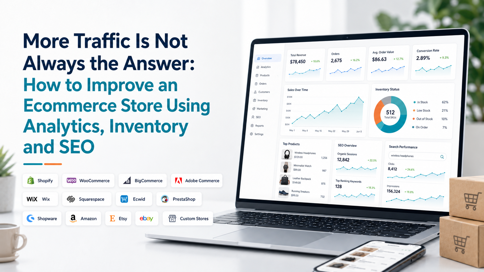
Shopify’s current Analytics dashboard is customizable: merchants can add, remove, resize and organize metric cards, compare periods and open deeper reports from individual cards. Shopify also says dashboard data for key sales, sessions and fulfillment metrics is generally updated within about a minute.
That flexibility is useful, but it creates another question: which metrics deserve space on your dashboard? For most merchants, these 12 provide a strong starting point.
1. Net Sales: Your Starting Point, Not Your Conclusion
Sales are usually the first thing merchants check, but the headline number should start an investigation rather than end one. If sales rise, ask what created the increase. More orders? Higher-value baskets? More repeat customers? One unusually successful product?
If sales fall, the same principle applies. A sales decline does not automatically mean demand has disappeared. Treat sales as the signal that tells you where to investigate next. A useful dashboard displays the current figure alongside the comparable previous period so you can immediately see direction rather than an isolated number.
2. Order Count: Did More People Actually Buy?
Revenue and orders answer different questions. Suppose sales increase by 18%, but order count rises by only 2%. Your growth probably did not come mainly from acquiring many more purchases. Customers may instead have spent more per order.
Now reverse the situation. Orders increase significantly while sales remain almost flat. More transactions are happening, but the average value of those purchases may have fallen. That is why sales and orders should sit close together on your dashboard.
Shopify defines its Orders over time metric as the number of orders received during the selected period. Its order reports can also show average units ordered, average order value and returned items, giving merchants useful context around order volume.
3. Average Order Value: Are Customers Spending More or Less?
Average order value or AOV, helps explain the relationship between orders and revenue. If you receive roughly the same number of orders but sales fall, AOV is one of the first metrics to inspect.
A lower AOV could reflect a change in product mix, heavier discounting, fewer items per basket or unavailable premium products. A higher AOV could come from larger baskets, bundles or greater demand for higher-priced products.
The key is not simply trying to make AOV increase forever. It is understanding why it changed. AOV becomes particularly useful when reviewed alongside product performance and inventory rather than as an isolated KPI.
4. New Customers: Is the Store Still Attracting Buyers?
A healthy store usually needs a continuing flow of first-time buyers. Tracking new customers helps you understand whether acquisition activity is bringing genuinely new people into the business.
However, new-customer growth should not automatically be treated as success. If you are acquiring significantly more first-time customers but total revenue barely moves, you may need to investigate order value, conversion quality or whether those customers ever return.
New customers tell you about acquisition.
They do not tell you about loyalty.
That requires another metric.
5. Returning Customers: Are People Coming Back?
Returning-customer activity gives you a different view of store quality. If previous buyers continue returning, the business is generating value beyond the first transaction. If returning activity steadily declines, the store may become increasingly dependent on continually acquiring new buyers.
Shopify currently offers customer reporting around new versus returning customers, returning customers, cohort analysis and other customer behavior. Its customer reports can also provide information such as order count and average order amount.
Do not compare only the number of new and returning customers. Compare the revenue contribution of each group when your analytics setup allows it. Ten highly valuable returning customers can matter more than fifty low-value first-time purchases.
6. Customer Retention: Is Growth Sticking?
Returning customers tell you who came back. Retention helps you look at the relationship over time. This is especially useful for stores selling products that naturally support repeat purchasing. Do not panic over one small short-term movement. Retention often needs a longer time horizon than daily revenue or order volume. Look for sustained changes.
If customer acquisition continues to grow while retention gradually falls, your store may appear healthy at the top of the funnel while becoming weaker underneath. That makes retention a useful weekly or monthly metric, rather than something most merchants need to watch several times each day.
7. Product Revenue: Which Products Are Carrying the Business?
A top-selling-products card should do more than satisfy curiosity. It should show which products actually contribute meaningfully to revenue. A product can rank highly by units sold but contribute less revenue than a lower-volume premium item. This is why product performance should ideally consider both units and monetary contribution.
Watch for concentration as well. If one or two products generate an unusually large share of total revenue, the store may be more exposed to inventory shortages, seasonal changes or declining demand for those particular products. That does not mean product concentration is automatically bad. It means you should know it exists.
8. Low-Stock Products: Which Future Sales Are at Risk?
Inventory metrics are often treated separately from analytics. They should not be. A low-stock alert becomes much more meaningful when connected with sales performance. Imagine two products each have eight units remaining. Product A sells one unit every two weeks. Product B sells six units per day.
The inventory number is identical, but the business risk is completely different. A useful dashboard helps you prioritize stock issues based on demand rather than simply producing a long list of products below a fixed quantity.
9. Out-of-Stock Best Sellers: Is Inventory Hiding Real Demand?
This is one of the easiest metrics to overlook. A product that generated zero sales yesterday may appear to have performed badly. But if it was unavailable, zero sales tell you nothing about actual customer demand. That is why product and inventory data belong together.
If store revenue falls, check whether important products were unavailable before assuming marketing, traffic or customer demand is responsible. This relationship can prevent expensive mistakes. Increasing ad spend will not solve a revenue problem caused by customers being unable to purchase the products they want.
10. Abandoned Checkouts: How Much Buying Intent Is Not Converting?
A visitor reaching checkout has moved much further toward purchase than someone simply browsing the site. When checkout abandonment increases, it deserves attention. The number alone does not tell you the exact reason.
Customers can leave because of shipping costs, delivery expectations, payment issues, hesitation or simple distraction. Think of abandoned checkouts as a diagnostic signal. If abandonment suddenly rises, compare the change with recent store updates, payment changes, promotions or delivery conditions rather than assuming one universal cause.
11. Checkout Recovery: Are Lost Opportunities Coming Back?
Abandonment tells you how many checkout opportunities were unfinished. Recovery tells you whether some of those customers later completed their purchases. Looking at these numbers together produces a much more useful picture.
For example, abandoned checkouts might increase during a high-traffic promotion. That initially looks negative. But if recovered checkouts also increase significantly, the final commercial impact may be less severe than the abandonment number suggests. Do not measure recovery just to produce a percentage. Use it to answer: Are our efforts bringing unfinished purchases back?
12. Refunds and Returns: How Much Revenue Are You Actually Keeping?
A sale is not necessarily the end of the transaction. If refunds or returns increase, part of the revenue recorded earlier is being reversed. That makes these metrics essential context for sales performance.
A particularly useful approach is to review refunds by product. If overall refund activity is stable but one product suddenly produces a disproportionate share, you have a much more specific problem to investigate.
Possible causes can include product expectations, sizing, quality, descriptions or fulfillment issues. Analytics identifies the pattern; customer feedback and operational review help establish the actual cause.

Do You Need All 12 Metrics on One Screen?
Probably not. The better approach is to organize your Shopify analytics dashboard around how frequently a metric needs attention.
Daily view
Your daily dashboard can stay focused on fast-moving operational signals:
Sales
Orders
Average order value
Important stock alerts
Checkout activity
Significant refunds
Weekly view
A weekly review is more useful for recognizing patterns:
Sales trends
Customer mix
Product performance
Inventory risk
Checkout recovery
Refund trends
Monthly view
Longer periods are better for understanding structural changes such as customer retention, customer segment performance and persistent changes in product demand. This prevents an important problem: reacting to normal daily volatility as though every movement requires action.
The Best Insight Usually Comes From Two Metrics, Not One
Individual KPIs are useful, but some of the strongest answers appear when metrics are paired.
Sales + Orders tells you whether revenue movement came from transaction volume.
Orders + AOV shows whether customers are spending differently.
Product Revenue + Inventory helps separate weak demand from unavailable stock.
New Customers + Returning Customers shows the balance between acquisition and repeat business.
Abandoned Checkouts + Recovery shows both lost intent and recovered opportunities.
Sales + Refunds gives a more realistic picture of revenue quality.
This is why a dashboard should not simply display as many numbers as possible. It should make relationships easier to notice. For a broader explanation of how store information connects across a business, see our guide to ecommerce data analytics.
What Should You Do When a Metric Turns Red?
Do not react immediately. First check whether the change is large enough to matter. Then compare the same metric with an appropriate previous period. After that, look at connected metrics. Imagine AOV falls sharply. Before discounting products or changing advertising, review product mix and stock availability. Perhaps several premium items were unavailable.
Or imagine orders fall. Check whether this happened alongside lower checkout completion or whether fewer customers reached the store in the first place. The dashboard should help narrow the investigation. It should not encourage you to make a different business change every time an arrow turns red.
Build a Dashboard Around Decisions, Not Vanity Metrics
A useful metric should do at least one of three things:
Describe performance.
Sales and orders show the current result.Explain performance.
AOV, customer segments and product contribution help explain why the result looks the way it does.Reveal risk or opportunity.
Low stock, abandoned checkouts and increasing refunds show where action may be needed.
If a dashboard card does none of these things for your business, consider removing it. Shopify currently lets merchants customize metric cards organize them into sections and compare dashboard performance across selected periods. The platform also supports deeper reports when more investigation is required. The goal is not to create the largest dashboard. It is to create one you can actually use.
Where an Analytics App Can Help
Shopify’s native analytics provides a customizable dashboard and deeper reports and for many merchants it will cover important reporting needs. A separate analytics application becomes useful when you want different data areas brought together in another way, additional operational alerts or plain-language explanations of store changes.
Statty AI is an AI-powered Shopify analytics app built around sales, customers, products, inventory, checkouts, refunds, store health and SEO information. Its Shopify analytics and reporting features are designed to help merchants move from seeing a change to investigating what might be behind it, without manually working through disconnected reports.
The Dashboard Test
The next time you open your analytics dashboard, do not ask: How many metrics can I see? Ask: Can I tell what changed, what contributed to it and what I should investigate next?
If your dashboard can answer those three questions without forcing you to search through dozens of unrelated reports, it is doing its job. The best Shopify analytics dashboard is not the one with the most data. It is the one that turns the right data into a clearer understanding of your store.