Modern Shopify revenue analytics can answer many of these questions directly inside a dashboard or reporting environment. The key is knowing how to analyze a trend instead of simply looking at the latest revenue total.
A Revenue Number Is Not a Trend
Suppose your store generated $42,000 this month compared with $36,000 last month. Revenue increased by roughly 17%. That tells you performance changed, but it does not yet tell you whether the store is genuinely improving. Perhaps a three-day promotion created most of the increase.
One unusually large order may have distorted the result. A best-selling product may have returned to stock after being unavailable the previous month. A revenue trend is a pattern observed across time. To understand one properly, you need to see the direction, duration and context of the change.
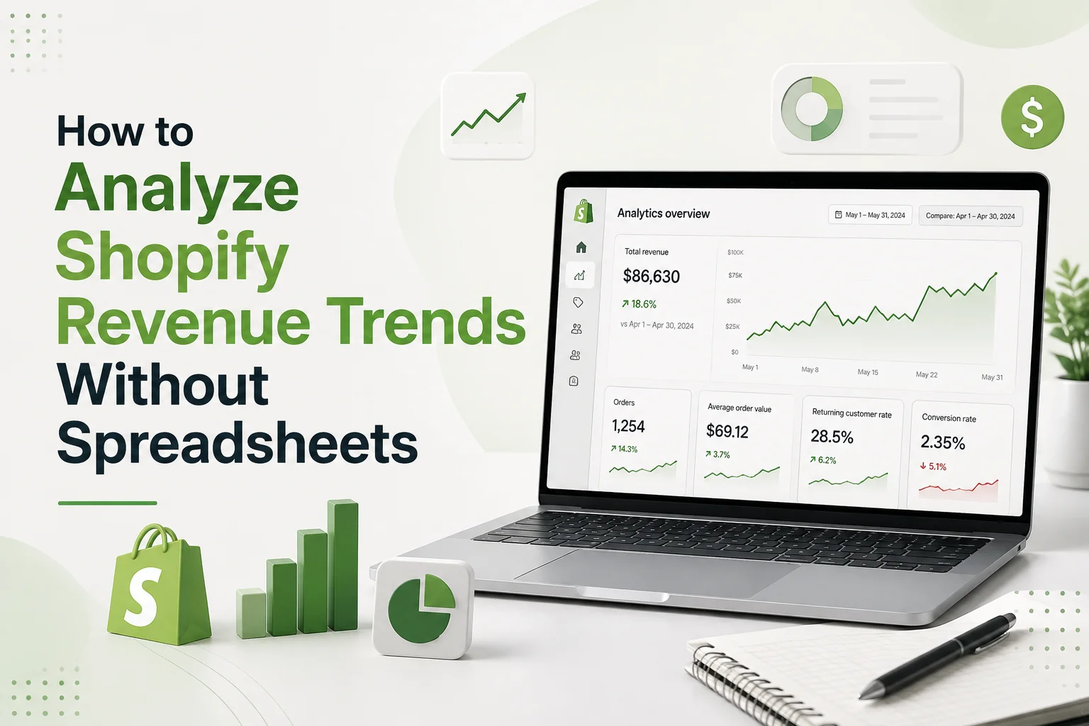
Shopify's current Analytics dashboard allows merchants to choose date ranges and compare performance with previous periods or the same period in a previous year. Its reports can also visualize data across different time intervals, which means many routine trend comparisons can be performed without exporting data first.
Start With the Revenue Measure You Actually Want to Analyze
Before comparing periods, make sure you are consistently using the same revenue or sales definition. Gross sales, net sales and total sales answer different questions. Mixing them between reports can make a perfectly normal difference look like a performance problem. For routine trend analysis, decide which measure best represents the question you are asking and use it consistently.
For example, if you want to understand how product sales are changing after discounts and returns, you may choose a net-sales view. If you are analyzing the full amount associated with customer purchases, another sales measure may be more appropriate. The important part is consistency. A trend built from one definition this month and another definition next month is not a reliable comparison.
Choose the Right Time Window
One of the biggest advantages of analyzing Shopify revenue directly in a dashboard is that you can change the time range without rebuilding formulas. But the time window still needs to match the business question. If you are investigating a sudden decline, daily data may be appropriate.
If you are trying to understand whether the business is growing, weekly or monthly trends provide better context. If the store has strong seasonality, year-over-year comparisons can be more meaningful than comparing December with November.
Shopify currently supports preset and custom ranges and lets merchants compare periods such as the last 30 days with the previous 30 days or the same period in the prior year. A useful rule is: Short windows explain events. Longer windows reveal direction. Do not let one unusually strong or weak day define your view of the business.
Look at the Shape of Revenue, Not Only the Percentage Change
A spreadsheet often reduces performance to one calculation: This month versus last month = +12% That is convenient, but the chart behind the number can tell a much richer story. Imagine two stores both grew 12%. Store A increased gradually throughout the month.
Store B remained flat for most of the month and then experienced one enormous sales spike during a promotion. The final percentage is identical. The underlying trend is completely different. When reviewing revenue visually, look for patterns such as gradual growth, sustained decline, isolated spikes, repeated weekly cycles or unusually volatile periods.
Shopify's reports allow merchants to choose visualizations and group time-based information by intervals such as day, month or quarter. The chart is not decoration. Its shape helps you decide whether you are looking at a trend or an event.
Find the Moment the Trend Changed
When revenue changes direction, identify when that change started. This narrows the investigation. Suppose weekly revenue had been relatively stable for two months and then began declining around July 15.
Do not analyze the entire quarter equally.
Ask what changed around that point.
Did a promotion finish?
Did an important product go out of stock?
Was pricing updated?
Did a new theme launch?
Did an app or checkout change go live?
Did advertising activity change?
Shopify's newer reporting tools can include annotations for events such as a product being published, a theme deployment or an app installation on reports with a time dimension. These annotations can provide useful context when investigating why a metric moved around a particular date. This is one area where dashboard-based analysis can actually be easier than a basic spreadsheet because the event context can sit beside the trend.
Break Revenue Down Before You Explain It
Once you know when revenue changed, avoid guessing at the cause. Break the result into smaller parts. A store-wide revenue decline may actually come almost entirely from one product category. A growth period may be driven by one sales channel. Overall performance may be flat while returning-customer revenue is falling and new-customer revenue is compensating for it.
The question becomes: Which part of the business contributed most to the change? Depending on your store and reporting setup, useful breakdowns can include product, sales channel, customer group or time period.
This is more efficient than exporting everything into a spreadsheet and manually sorting hundreds of rows. If one product explains most of the revenue decline, you have already reduced a store-wide investigation to one specific area.
Separate Recurring Growth From One-Time Revenue
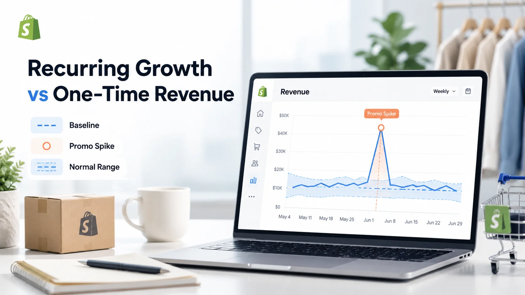
Not every increase deserves to be treated as a new baseline. Suppose your store normally generates around $8,000 per week. One week reaches $15,000 because of a large promotional campaign. The following week returns to $8,500.
If you compare only the promotion week with the week before it, performance looks exceptional. If you compare the next week with the promotion, it looks terrible. Neither interpretation tells you much about the underlying business.
When you see an unusual spike, ask whether the event is likely to repeat. If it came from a one-time wholesale order, flash sale or influencer mention, keep it in the historical data but do not automatically treat it as normal future performance. Trend analysis is partly about identifying what belongs to the baseline and what should be treated as an exception.
Compare Revenue With a Driver, Not With Ten Unrelated Metrics
You do not need a giant spreadsheet with twenty columns to understand every revenue movement. Start with the most likely driver.
If revenue falls sharply while order volume remains stable, investigate average order value.
If both revenue and orders decline together, the problem may be related more closely to purchase volume.
If revenue falls around one important product, check its availability and recent performance.
If sales increase but the improvement appears concentrated among existing buyers, look at returning-customer contribution.
This approach keeps the analysis focused. You can move deeper only when the first comparison does not explain enough. Our guide to Shopify metrics explains how revenue, orders, AOV and adjustments can be read together when you need more detail at the transaction level.
Use a Baseline Instead of Reacting to Every Movement
Stores develop recurring patterns. A merchant may learn that Friday revenue is normally stronger than Tuesday revenue. Certain products may perform better at the beginning of each month. Weekend revenue may regularly behave differently from weekday performance.
Once these patterns are known, they become a baseline. The question stops being: Revenue fell 8% today. What is wrong? It becomes: Is today's revenue unusually low compared with what normally happens on this type of day?
That is a much better analytical question. You do not necessarily need statistical software to build this understanding. Consistently reviewing equivalent periods over time can reveal what normal performance looks like for your store.
Use Reports as an Investigation Layer
Your dashboard should tell you where to look. A deeper report should tell you more about why. Shopify's current Analytics experience connects dashboard metric cards with corresponding reports, and reports can be filtered, adjusted, compared and saved as custom data explorations. This creates a useful workflow:
Dashboard: Revenue looks unusual.
Comparison: The change started last week.
Report: Most of the decline came from three products.
Context: Two products were unavailable for several days.
Decision: Investigate stock planning before changing marketing activity.
No spreadsheet was required because each step answered a progressively narrower question.
Let AI Handle Part of the Investigation, Not the Decision
A newer approach to revenue analysis is to ask questions directly about connected store data. Instead of manually moving between several reports, a merchant might ask: Why did revenue fall compared with last week? Or: Which products contributed most to this month's increase? Or: Was revenue growth driven more by orders or by higher order value?
This can reduce the time between spotting a trend and knowing where to investigate. Statty AI's current product positioning combines revenue, orders, customers, products, inventory, checkout activity and other store information with plain-language AI insights. Its website describes revenue tracking, period comparisons and AI answers based on connected Shopify store data.
An AI-powered Shopify analytics app can therefore be useful when you want the relationships between metrics explained without manually assembling the analysis. AI should still support judgment rather than replace it. A useful answer should point you toward the relevant data and allow you to verify the conclusion.
When a Spreadsheet Is Still the Right Tool
Avoiding spreadsheets does not mean spreadsheets are bad. They remain useful when you need highly customized financial modelling, external datasets, complex forecasting, accounting workflows or calculations that your analytics platform does not support.
The problem arises when merchants export data automatically even though the original question could have been answered directly in their reporting environment. Every export creates additional work. The file can become outdated, formulas can break and different team members may end up working from different versions.
Before exporting, ask: What am I trying to calculate that I cannot answer directly here? If you cannot name that requirement, you may not need the spreadsheet.
Create a Simple Revenue-Trend Routine
You can make revenue analysis much more useful by following the same process every time. Start with your chosen revenue measure and compare it with an equivalent previous period. Look at the chart to decide whether the change is sustained or caused by an isolated event. Identify when the movement began, then break the result down by the most relevant dimension.
Once you have a likely explanation, connect revenue with one or two supporting metrics and decide whether action is necessary. The workflow becomes: Compare → Locate → Break down → Explain → Act This is much simpler than downloading raw data every week and rebuilding the same spreadsheet.
Revenue Trends Should Answer a Business Question
The purpose of Shopify revenue analytics is not to create better charts. It is to help you understand whether your store is genuinely moving in the right direction and what is contributing to that movement. If revenue increases, determine whether the improvement is broad, sustainable and repeatable.
If revenue declines, locate when the change began and which part of the business contributed most. If the trend is unusual, investigate related products, customers, orders or inventory before deciding what to change. A spreadsheet can help with these tasks, but it is no longer the only way to perform them.
Shopify's own analytics tools now provide customizable dashboards, date comparisons, report visualizations and deeper reporting, while platforms such as Statty AI can bring related store information and AI explanations together in one Shopify analytics dashboard. The best reporting workflow is not the one with the most formulas. It is the one that gets you from “revenue changed” to “here is what deserves our attention” with the least unnecessary work.